Kimi K3 କିପରି ନିଜେ ଏକ ଡିଜିଟାଲ୍ ଫାଉଣ୍ଟେନ୍ ପେନ୍ ଷ୍ଟ୍ରୋକ୍ ତିଆରି କଲା
 Gaoge Zhang
ଆମେ Lulucat Notes ରେ Freeform ର ଦିଗନିର୍ଦ୍ଦିଷ୍ଟ ଫାଉଣ୍ଟେନ୍ ପେନ୍ ଚାହୁଁଥିଲୁ। ଏହାର ନିର୍ଦ୍ଦେଶନା ଥିଲା ହାତଲେଖାର ଏକ ସ୍କ୍ରିନ୍ସଟ୍। ଦୁଇଟି ମଡେଲ୍, ଗୋଟିଏ ନିର୍ଣ୍ଣାୟକ ପ୍ରଶ୍ନ ଏବଂ ଗୋଟିଏ ଉପବୃତ୍ତାକାର ନିବ୍ ପରେ, ଜଳ କଲମ ଯେପରି ଲେଖିବା କଥା ସେପରି ଲେଖେ। ଗବେଷଣା, କୋଡ୍ ଏବଂ ଯାଞ୍ଚ Kimi K3 Fireworks ଉପରେ କରିଥିଲା।
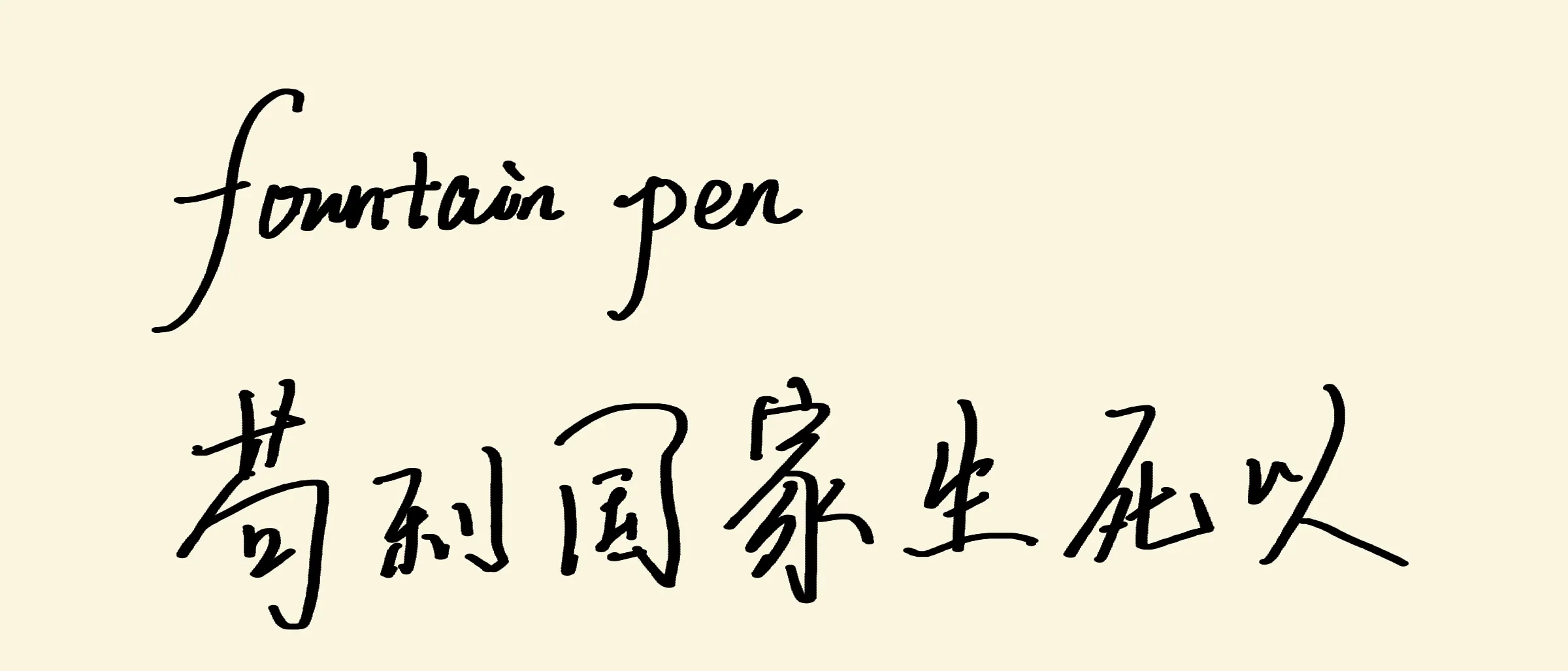
ଏହି post ରେ ଆଲୋଚିତ Lulucat Notes Metal pipeline ଦ୍ୱାରା render କରାଯାଇଛି।
Lulucat Notes ରେ ଗୋଟିଏ ସାଧା pen ଏବଂ ଗୋଟିଏ highlighter ଅଛି। roadmap ର ପରବର୍ତ୍ତୀ tool ଥିଲା ଗୋଟିଏ ଜଳ କଲମ — Apple Notes ଏବଂ Freeform ରେ ଦେଖିଥିବା ସେହି ଦିଗନିର୍ଦ୍ଦିଷ୍ଟ fountain pen, ଯେଉଁଠାରେ vertical stroke ମୋଟା ଏବଂ horizontal stroke ପତଳା ହୁଏ। ଏହି tool ର spec କୌଣସି document ନଥିଲା। ଏହା ଥିଲା ଗୋଟିଏ screenshot: ହାତଲେଖାର ତିନିଟି ଧାଡ଼ି, ଶବ୍ଦ “pencilkit”, “无边记” ଏବଂ “这种有方向的水笔能力” — ଏହି ଦିଗନିର୍ଦ୍ଦିଷ୍ଟ ଜଳ-କଲମ କ୍ଷମତା।
ପୂର୍ବର Metal pipeline ପରି, ଏହି କାମ Moonshot ର Fireworks ଉପରେ ଚାଲୁଥିବା open model Kimi K3 କରିଥିଲା: measurement, modeling, code ଏବଂ validation। ମଣିଷ screenshot ଦେଲା, ଗୋଟିଏ ପ୍ରଶ୍ନର ଉତ୍ତର ଦେଲା ଏବଂ ଏକ ପ୍ରକୃତ iPad ରେ feel ବିଚାର କଲା।
Spec ହେଉଛି ଗୋଟିଏ screenshot
ଗୋଟିଏ static image ଆପଣଙ୍କୁ କହିପାରେ ନାହିଁ ଯେ stroke କାହିଁକି ପତଳା। ଏହା କେବଳ କେତେ ପତଳା ଏବଂ କେଉଁଠି ଅଛି ତାହା ଦେଖାଇପାରେ। ତେଣୁ ପ୍ରଥମ ପଦକ୍ଷେପ ଥିଲା measurement। ଆମେ screenshot କୁ row ପରେ row ଏବଂ column ପରେ column scan କଲୁ, ପ୍ରତ୍ୟେକ stroke ର centerline drift କୁ track କରି ତାହାର direction ପାଇଲୁ, ତାପରେ ସେହି angle ର sine ବ୍ୟବହାର କରି scan width କୁ true width ରେ ପରିଣତ କଲୁ:
| Stroke | Direction | True width |
|---|---|---|
| “l” ascender, “pencilkit” | ≈ 78° | 27.3 px |
| “k” stem, “pencilkit” | ≈ 90° | 28 px |
| 力 ର ବାମକୁ ତଳକୁ ଯାଉଥିବା sweep | ≈ 66° | 25.7 px |
| Cursive connectors | ≈ 8° | 11 px |
| ଚୀନୀ horizontals (横) | ≈ 0° | 6–11 px |
ମୋଟାରୁ ପତଳା ଅନୁପାତ ≈ 2.5। 66° point ସହ
Version one: direction ରୁ width
ପ୍ରଥମ model ଥିଲା ସବୁଠାରୁ ସ୍ପଷ୍ଟଟି। ପ୍ରତ୍ୟେକ input point ପାଇଁ direction ଗଣନା କର, fitted curve ମାଧ୍ୟମରେ direction କୁ width ରେ map କର, ଏବଂ capture ସମୟରେ ଫଳାଫଳକୁ point ର radius ଭିତରେ bake କର। Direction କୁ causal ଭାବରେ ଆକଳନ କରାଯାଉଥିଲା — arc ର ଶେଷ କିଛି point ଉପରେ exponentially decaying weighted average, doubled-angle space ରେ ଗଣନା କରାଯାଇଥିଲା ଯାହାଦ୍ୱାରା ଗତିର reversal ଆକଳନକୁ cancel ନକରେ। କେବଳ ପୂର୍ବରୁ ଆସିଥିବା point ବ୍ୟବହାର ହୁଏ, ତେଣୁ live stroke ଏବଂ committed stroke byte ପରେ byte ମେଳ ଖାଏ।
Builder ନିଜର unit check ପାସ୍ କଲା: synthetic horizontal, vertical, 45° ଏବଂ reversal path ସବୁ theoretical width bake କଲେ — 0.99, 2.52, 2.00 ଏବଂ 0.99 points। Rendering ପାଇଁ ନୂଆ code ଦରକାର ହେଲା ନାହିଁ: baked-radius stroke କେବଳ round stamp ର ଏକ chain, ଏବଂ ଆମ point-sprite pipeline ସେଗୁଡ଼ିକୁ ଆଗରୁ ଅଙ୍କୁଥିଲା।
iPad ରେ ମଣିଷ ପ୍ରାୟ ଦଶ ସେକେଣ୍ଡରେ ଏହାକୁ ଖାରଜ କଲା: “ଏହା art pen, ଜଳ କଲମ ନୁହେଁ”।
ଗୋଟିଏ ଚିତ୍ରରେ ଦୁଇଟି ବ୍ୟାଖ୍ୟା
ଏହା ଭୁଲ ଲାଗୁଥିଲା କାହିଁକି? ଦୁଇଟି ସମ୍ଭାବ୍ୟ ବ୍ୟାଖ୍ୟା ଥିଲା, ଏବଂ screenshot ସେଗୁଡ଼ିକୁ ଅଲଗା କରିପାରୁନଥିଲା:
- Direction lock। Nib ର geometry ହାତ ଯାହା କରୁ ନା କାହିଁକି, horizontal କୁ ପତଳା ଏବଂ vertical କୁ ମୋଟା ରଖେ। Version one ଏହିଟି implement କରିଥିଲା।
- Pressure ଏବଂ speed। Pen ଚାପ ଦ୍ୱାରା ଚାଲେ, ଏବଂ sample ର pattern କେବଳ handwriting dynamics: downstroke ରେ ସ୍ୱାଭାବିକ ଭାବେ ଅଧିକ ଚାପ ପଡ଼େ, connector ସ୍ୱାଭାବିକ ଭାବେ ଶୀଘ୍ର ଏବଂ ହାଲୁକା ହୁଏ।
ଦୁଇଟି ବ୍ୟାଖ୍ୟା ହିଁ ପତଳା horizontal ଏବଂ ମୋଟା vertical ସହ screenshot ଦିଏ। ପାର୍ଥକ୍ୟ ଦେଖାଯାଏ ଯେତେବେଳେ ଆପଣ horizontal stroke ଉପରେ ଜୋରରେ ଚାପ ଦିଅନ୍ତି। Version one ଏହାକୁ ପତଳା ରଖେ। Pressure pen ଏହାକୁ ମୋଟା କରେ। ତେଣୁ ଆମେ ମଣିଷକୁ ଗୋଟିଏ ପ୍ରଶ୍ନ ପଚାରିଲୁ: ଜୋରରେ ଚାପିଥିବା horizontal stroke ଅଧିକ ମୋଟା ହେବା ଉଚିତ୍ କି?
“ନା। Horizontals ପତଳା ରହିବ।”
Direction lock ନିଶ୍ଚିତ ହେଲା। କିନ୍ତୁ ଆଉ କିଛି ଭୁଲ ଥିଲା, କାରଣ version one ମଧ୍ୟ direction-locked ଥିଲା।
ଉତ୍ତର stroke ର ଶେଷରେ ଥିଲା
ପରବର୍ତ୍ତୀ clue ascender ର ଶୀର୍ଷରେ ଥିଲା। Sample ର “l” ଏବଂ “k” stem କୁ zoom କରି ଦେଖିଲେ ଦୁଇଟି କଥା ଜଣାପଡ଼ିଲା: ଗୋଟିଏ straight stroke ଆରମ୍ଭରୁ ଶେଷ ପର୍ଯ୍ୟନ୍ତ ଏକେ width ରଖେ, ଏବଂ stroke end ଗୁଡ଼ିକ flat diagonal cut — କାଗଜରୁ ଉଠୁଥିବା chisel nib ର ଆକାର। Round dot ନୁହେଁ। Pressure taper ନୁହେଁ।
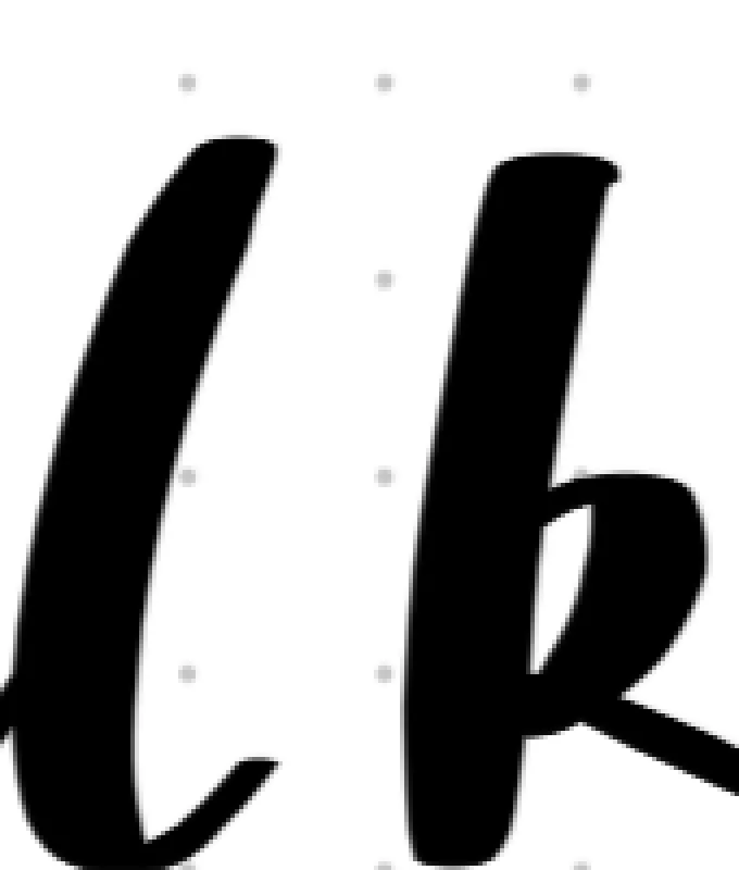
ଏହି ହେଉଛି “art pen feel” ର ପ୍ରକୃତ ଅର୍ଥ। Version one sample ର look କୁ model କରିଥିଲା — ଆକଳନ କରାଯାଇଥିବା direction ର function ଭାବେ width — କିନ୍ତୁ pen କୁ ନୁହେଁ। Direction estimator ଗୋଟିଏ sensor: noisy input ରେ ଏହା jitter କରେ, corner ନିକଟରେ lag କରେ ଏବଂ ପ୍ରତ୍ୟେକ stroke end କୁ circle କରିଦିଏ। ପ୍ରକୃତ nib ର ଏହି ସମସ୍ୟା କିଛି ନାହିଁ, କାରଣ ଏହା କିଛି compute କରେ ନାହିଁ। Width ହେଉଛି geometry।
Version two: ଗୋଟିଏ ellipse nib
ଅନ୍ତିମ model ରେ କୌଣସି direction estimator ନାହିଁ। Nib ହେଉଛି ଗୋଟିଏ oriented ellipse: long axis horizontal, short axis fixed। ଏହି ellipse ର stamp ଗୁଡ଼ିକ stroke ର path ଉପରେ ଘନ ଭାବରେ ରଖାଯାଏ, ଏବଂ ବାକି ସବୁ geometry ରୁ ଆସେ:
-
Horizontal stroke ଖୋଲା edge ଦେଇ ଯାଏ, ତେଣୁ ଏହା ସବୁବେଳେ
ଚଉଡ଼ା — ଯେକୌଣସି pressure ରେ ଗୋଟିଏ ସ୍ଥିର ପତଳା line। ନିଶ୍ଚିତ ହୋଇଥିବା spec ଠିକ୍ ଏହିଟି। -
Vertical stroke ସମ୍ପୂର୍ଣ୍ଣ long axis କୁ ଅତିକ୍ରମ କରେ:
, ମୋଟା ଶେଷ। -
Diagonal stroke ଗତିର perpendicular ଦିଗରେ ellipse ର chord width ନିଏ,
-
Stroke end ଗୁଡ଼ିକ ellipse cut — sample ର flat nib-shaped end, ଅଲଗା କାମ ଛଡ଼ା।
-
Pressure କେବଳ long axis କୁ scale କରେ,
, ତେଣୁ downstroke ରେ ink volume ବଢ଼େ ଏବଂ horizontal କେବେ ମୋଟା ହୋଇପାରେ ନାହିଁ।
Sample measurement ରୁ ଆମେ
Rendering ପାଇଁ ଗୋଟିଏ ନୂଆ fragment shader ଏବଂ ଆଉ କିଛି ଦରକାର ହେଲା ନାହିଁ। Vertex format — position, diameter, color — ପୂର୍ବରୁ ସବୁ ବହନ କରୁଥିଲା: diameter ହେଉଛି long axis, ଏବଂ short axis ହେଉଛି ପ୍ରତ୍ୟେକ pass ପାଇଁ ଗୋଟିଏ uniform। Shader ଆମ round stamp ଭଳି ସମାନ half-pixel coverage ramp ସହ ellipse SDF evaluate କରେ; ସେଥିପାଇଁ ଏହା Core Graphics reference implementation (fillEllipse per stamp) ସହ pixel ପରେ pixel ତୁଳନୀୟ ରହେ। Validation ସାଧାରଣ gate ଦେଇ ଗଲା: ଦୁଇଟି fountain stroke ଥିବା synthetic corpus, ଦୁଇ ପ୍ରକାରରେ render କରି pixel ପରେ pixel ତୁଳନା — zero structural difference, ଏବଂ spot-check କରାଯାଇଥିବା horizontal stroke ଦୁଇ renderer ରେ 12 px ମାପିଲା।
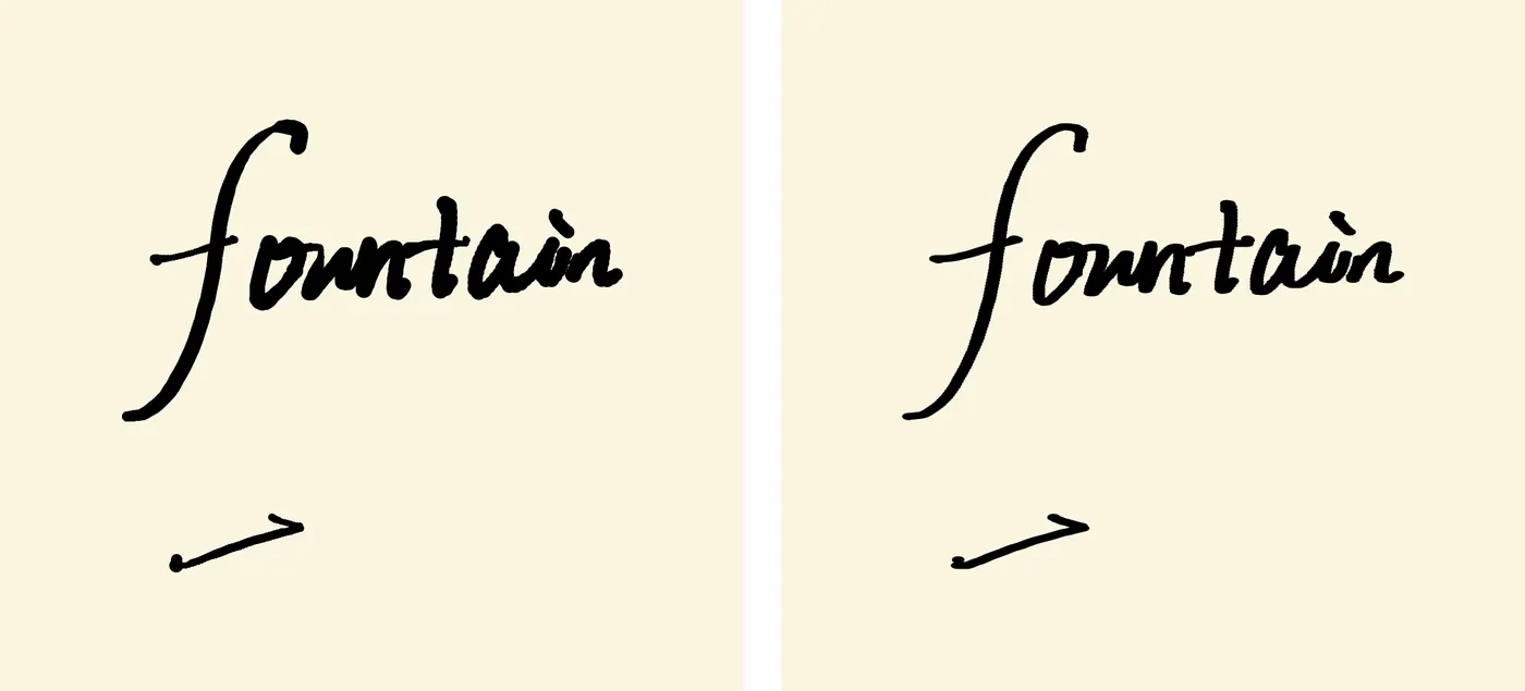
Version one ବାମରେ, version two ଡାହାଣରେ। ସମାନ handwritten input, ସମାନ pipeline। ଶେଷଗୁଡ଼ିକ କାହାଣୀ କହେ।
iPad ରେ ନୂଆ pen ସଙ୍ଗେସଙ୍ଗେ ପାସ୍ କଲା: “好,很好” — ଭଲ। ବହୁତ ଭଲ।
ଏହି ଭୁଲକୁ ରଖିବା
Version one bin କୁ ଯାଇନଥିଲା। ଏହା ଗୋଟିଏ ଆଗ୍ରହଜନକ brush — କେବଳ ଜଳ କଲମ ନୁହେଁ। ତେଣୁ ଏହା ନୂଆ experimental-brush menu ର ପ୍ରଥମ entry ଭାବେ ship ହେଲା, ମଣିଷ ଦେଇଥିବା ନାମରେ: 漏水的圆珠笔, ଲିକ୍ କରୁଥିବା ballpoint। Toolbar ରେ ଗୋଟିଏ flask button ଆସିଲା, ଯାହା experiment ର text list ଖୋଲେ; ପରବର୍ତ୍ତୀଟି ଯୋଡ଼ିବାକୁ registry ରେ ଗୋଟିଏ line ଯଥେଷ୍ଟ। ଖାରଜ ହୋଇଥିବା model ନଷ୍ଟ କାମ ନୁହେଁ, ଯଦି ଏହା ସ୍ପଷ୍ଟ ଭାବେ label କରାଯାଇଥିବା experiment ଭାବେ ship ହୋଇପାରେ।
ଗୋଟିଏ ସନ୍ଧ୍ୟାର loop
ସମ୍ପୂର୍ଣ୍ଣ ପ୍ରକ୍ରିୟା — measure, model, build, device, question, remodel, rebuild, validate — ଗୋଟିଏ ସନ୍ଧ୍ୟା ନେଲା। Fireworks ଉପରେ Kimi K3 ଏହି loop ର ସମ୍ପୂର୍ଣ୍ଣ technical ଭାଗ ଚଳାଇଲା: measurement scan ତିଆରି କଲା, ଦ୍ୱିତୀୟଥର ଅନୁମାନ କରିବା ପରିବର୍ତ୍ତେ ନିର୍ଣ୍ଣାୟକ ପ୍ରଶ୍ନ ପ୍ରସ୍ତାବ କଲା, evidence ବଦଳିଲେ ନିଜର direction estimator କୁ delete କଲା, ଏବଂ app କୁ ଛୁଇଁବା ପୂର୍ବରୁ pixel-diff harness କୁ ବଢ଼ାଇଲା। Fireworks ର inference speed loop କୁ interactive ରଖିଲା — ଲମ୍ବା Metal ଏବଂ Swift diff, pixel-analysis script ଏବଂ corpus tooling ସବୁ ଏତେ ଶୀଘ୍ର ଆସିଲା ଯେ bottleneck ଯେଉଁଠି ରହିବା କଥା ସେଠି ରହିଲା: ମଣିଷର ବିଚାର।
ସହଯୋଗର pattern Metal pipeline post ରେ ଥିବା ସେହି pattern ଥିଲା, ଏବଂ ପୁଣି କାମ କଲା: model ଦ୍ରୁତ ଏବଂ precise; ମଣିଷ taste ଏବଂ end-to-end verification ର ଦାୟିତ୍ୱ ନିଏ। feel ଉପରେ ଆଧାରିତ feedback ର ଗୋଟିଏ ବାକ୍ୟ — “art pen, ଜଳ କଲମ ନୁହେଁ” — model କୁ ନିଖୁତ modeling error ଖୋଜି ଏକ ସରଳ design ରେ ବଦଳାଇବା ପାଇଁ ଯଥେଷ୍ଟ ହେଲା।
ଠିକ୍ model ଭୁଲ model ଠାରୁ ଛୋଟ ହେଲା। Version two ରେ version one ଠାରୁ କମ୍ moving parts ଥିଲା — estimator ନାହିଁ, smoothing window ନାହିଁ, fitted exponent ନାହିଁ। Nib width compute କରେ ନାହିଁ। Nib ହିଁ width।