How Kimi K3 developed a digital fountain-pen stroke independently
 Gaoge Zhang
We wanted Freeform's directional fountain pen in Lulucat Notes. The spec was a screenshot of handwriting. Two models, one discriminating question, and an ellipse nib later, the water pen writes as it should. Kimi K3 did the research, code, and validation on Fireworks.
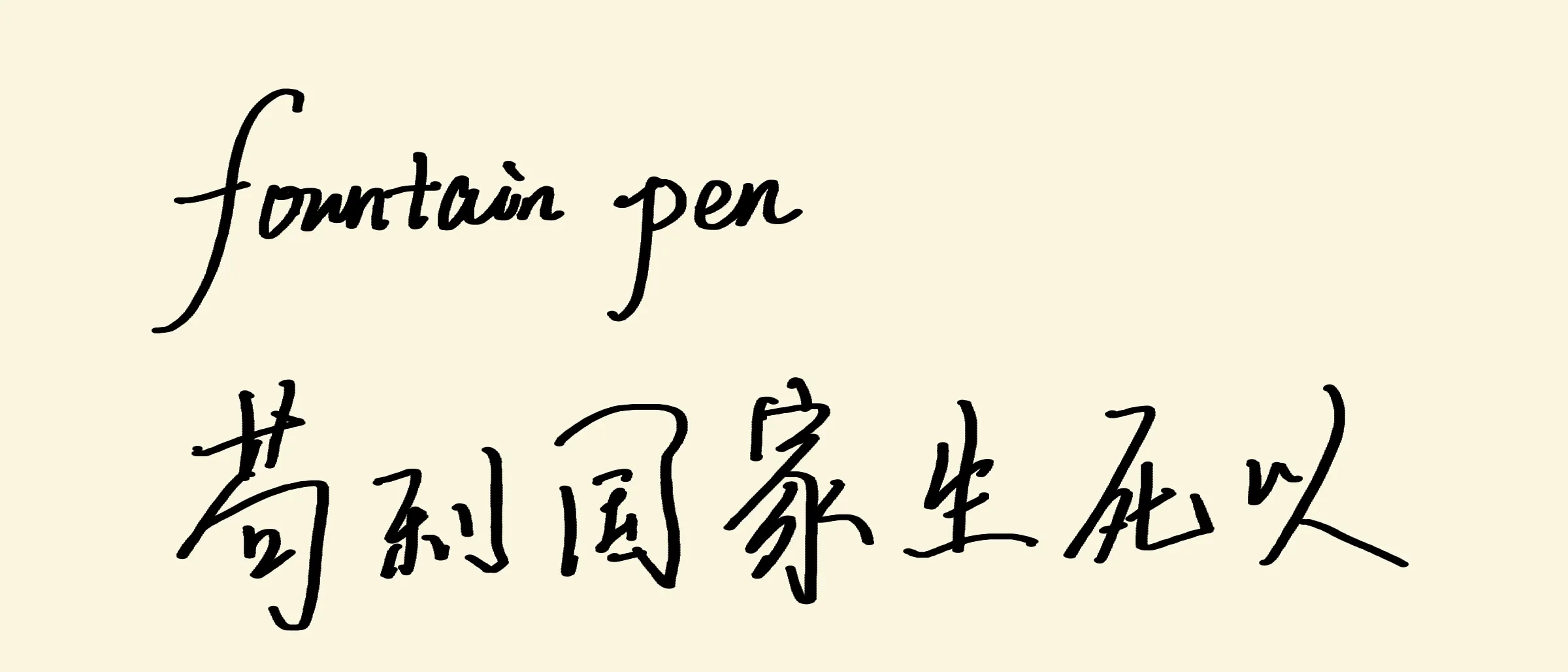
Rendered by the Lulucat Notes Metal pipeline this post is about.
Lulucat Notes has a plain pen and a highlighter. The next tool on the roadmap was a water pen — the directional fountain pen you know from Apple Notes and Freeform, where vertical strokes come out thick and horizontal strokes come out thin. The spec for this tool was not a document. It was a screenshot: three lines of handwriting, the words “pencilkit”, “无边记”, and “这种有方向的水笔能力” — this directional water-pen ability.
Like the Metal pipeline before it, the work was done by Kimi K3, Moonshot’s open model running on Fireworks: the measuring, the modelling, the code, and the validation. The human provided the screenshot, answered one question, and judged the feel on a real iPad.
The spec is a screenshot
A static image cannot tell you why a stroke is thin. It can only tell you how thin, and where. So the first step was measurement. We scanned the screenshot row by row and column by column, tracking each stroke’s centreline drift to get its direction, then converted scan width to true width with the sine of that angle:
| Stroke | Direction | True width |
|---|---|---|
| “l” ascender, “pencilkit” | ≈ 78° | 27.3 px |
| “k” stem, “pencilkit” | ≈ 90° | 28 px |
| Left-falling sweep of 力 | ≈ 66° | 25.7 px |
| Cursive connectors | ≈ 8° | 11 px |
| Chinese horizontals (横) | ≈ 0° | 6–11 px |
Thick-to-thin ratio ≈ 2.5. Fitting
Version one: width from direction
The first model was the obvious one. Compute a direction for every input point, map direction to width through the fitted curve, bake the result into the point’s radius at capture time. Direction was estimated causally — an exponentially decaying weighted average over the last few points of arc, computed in doubled-angle space so that a reversal of travel does not cancel the estimate. Only past points are used, so the live stroke and the committed stroke agree byte for byte.
The builder passed its unit check: synthetic horizontal, vertical, 45°, and reversal paths all baked the theoretical widths — 0.99, 2.52, 2.00, and 0.99 points. Rendering needed no new code at all: a baked-radius stroke is just a chain of round stamps, and our point-sprite pipeline already drew those.
On the iPad, it took the human about ten seconds to reject it: “this is an art pen, not the water pen.”
Two stories fit one picture
Why did it feel wrong? There were two candidate explanations, and the screenshot could not separate them:
- Direction lock. The nib geometry forces horizontals thin and verticals thick, whatever the hand does. That is what version one implemented.
- Pressure and speed. The pen is pressure-driven, and the sample’s pattern is just handwriting dynamics: downstrokes naturally pressed, connectors naturally quick and light.
Both produce a screenshot with thin horizontals and thick verticals. The difference is what happens when you press hard on a horizontal stroke. Version one keeps it thin. A pressure pen makes it thick. So we asked the human one question: should a hard-pressed horizontal get thicker?
“No. Horizontals stay thin.”
Direction lock confirmed. But something else was wrong, because version one was direction-locked too.
The answer was in the stroke ends
The next clue was at the top of the ascenders. Zooming into the “l” and “k” stems in the sample showed two things: a straight stroke holds one width from start to finish, and the stroke ends are flat diagonal cuts — the shape of a chisel nib lifting off. Not round dots. Not pressure tapers.
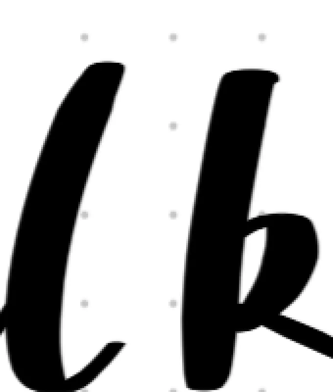
That is what the human meant by “art pen feel.” Version one modelled the look of the sample — width as a function of estimated direction — but not the pen. A direction estimator is a sensor: it jitters on noisy input, it lags around corners, and it rounds every stroke end into a circle. A real nib has none of these problems, because it does not compute anything. The width is geometry.
Version two: an ellipse nib
The final model has no direction estimator at all. The nib is an oriented ellipse: long axis horizontal, short axis fixed. Stamps of this ellipse are placed densely along the stroke’s path, and everything else falls out of the geometry:
-
A horizontal stroke travels along the open edge, so it always comes out
wide — a constant thin line, at any pressure. Exactly the confirmed spec. -
A vertical stroke crosses the full long axis:
, the thick end. -
A diagonal stroke takes the ellipse’s chord width perpendicular to travel,
-
Stroke ends are elliptical cuts — the flat nib-shaped ends from the sample, for free.
-
Pressure scales only the long axis,
, so pressure buys you ink volume on downstrokes and can never fatten a horizontal.
From the sample measurements we kept
Rendering needed one new fragment shader and nothing else. The vertex format — position, diameter, color — already carried everything: diameter is the long axis, and the short axis is a per-pass uniform. The shader evaluates an ellipse SDF with the same half-pixel coverage ramp as our round stamps, which is what keeps it pixel-comparable to the Core Graphics reference implementation (fillEllipse per stamp). Validation ran through the usual gate: a synthetic corpus with two fountain strokes, rendered both ways, compared pixel by pixel — zero structural differences, and a spot-checked horizontal stroke measured 12 px in both renderers.
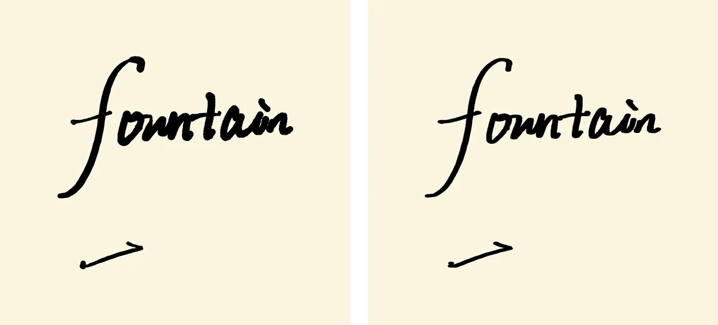
Version one left, version two right. Same handwritten input, same pipeline. The ends tell the story.
On the iPad, the new pen passed at once: “好,很好” — good. Very good.
Keeping the miss
Version one did not go in the bin. It is an interesting brush — it just is not a water pen. So it shipped as the first entry in a new experimental-brush menu, under the name the human gave it: 漏水的圆珠笔, the leaky ballpoint. The toolbar got a flask button that pops a text list of experiments; adding the next one costs one line in a registry. A rejected model is not wasted work when it can ship as a clearly labelled experiment.
One evening of loops
The full arc — measure, model, build, device, question, remodel, rebuild, validate — took one evening. Kimi K3 on Fireworks ran the full technical side of the loop: devising the measurement scans, proposing the discriminating question instead of guessing a second time, deleting its own direction estimator when the evidence turned, and extending the pixel-diff harness before touching the app. Fireworks’ inference speed kept the loop interactive — long Metal and Swift diffs, pixel-analysis scripts, and corpus tooling all arrived fast enough that the remaining bottleneck was human judgement.
The collaboration pattern was the same one from the Metal pipeline post, and it held: the model is fast and precise; the human owns taste and end-to-end verification. One sentence of feel-based feedback — “art pen, not water pen” — was enough for the model to locate the exact modelling error and replace it with a simpler design.
The right model turned out to be smaller than the wrong one. Version two shipped fewer moving parts than version one — no estimator, no smoothing window, no fitted exponent. The nib does not compute the width. The nib is the width.