Kimi K3 ഒരു ഡിജിറ്റൽ ഫൗണ്ടൻ പേൻ സ്ട്രോക്ക് എങ്ങനെ നിർമ്മിച്ചു
 Gaoge Zhang
Lulucat Notes-ൽ Freeform-ന്റെ ദിശാപരമായ ഫൗണ്ടൻ പേൻ ഞങ്ങൾക്ക് വേണമായിരുന്നു. സ്പെസിഫിക്കേഷൻ ഒരു കൈയക്ഷര സ്ക്രീൻഷോട്ടായിരുന്നു. രണ്ട് മോഡലുകൾ, അവയെ വേർതിരിക്കുന്ന ഒരു ചോദ്യം, ഒരു എലിപ്സ് പേൻനിബ് എന്നിവയ്ക്ക് ശേഷം വാട്ടർ പേൻ വേണ്ട രീതിയിൽ എഴുതാൻ തുടങ്ങി. ഗവേഷണം, കോഡ്, സാധൂകരണം എന്നിവ Fireworks-ലെ Kimi K3 ആണ് ചെയ്തത്.
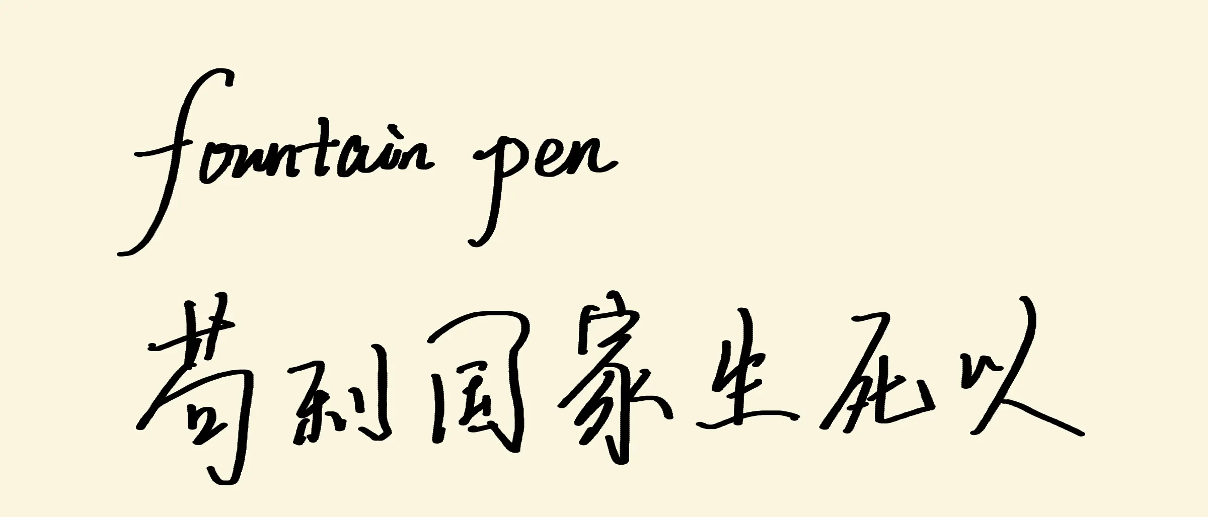
ഈ പോസ്റ്റിന്റെ വിഷയമായ Lulucat Notes Metal pipeline ആണ് ഇത് render ചെയ്തത്.
Lulucat Notes-ൽ ഒരു സാധാരണ pen-ഉം ഒരു highlighter-ഉം ഉണ്ട്. Roadmap-ലെ അടുത്ത tool ഒരു water pen ആയിരുന്നു — Apple Notes, Freeform എന്നിവയിൽ നിന്ന് പരിചിതമായ directional fountain pen; അതിൽ vertical strokes കട്ടിയുള്ളതായും horizontal strokes നേർത്തതായും വരുന്നു. ഈ tool-ന്റെ spec ഒരു document ആയിരുന്നില്ല. അത് ഒരു screenshot ആയിരുന്നു: കൈയക്ഷരത്തിലുള്ള മൂന്ന് വരികൾ, “pencilkit”, “无边记”, “这种有方向的水笔能力” എന്നീ വാക്കുകൾ — ഈ directional water-pen ability.
മുമ്പത്തെ Metal pipeline പോലെ, ഈ ജോലിയും Fireworks-ൽ പ്രവർത്തിക്കുന്ന Moonshot-ന്റെ open model ആയ Kimi K3 ആണ് ചെയ്തത്: measurement, modeling, code, validation എല്ലാം. മനുഷ്യൻ screenshot നൽകി, ഒരു question-ന് ഉത്തരം നൽകി, യഥാർത്ഥ iPad-ൽ അതിന്റെ feel വിലയിരുത്തി.
Spec ഒരു screenshot ആണ്
ഒരു static image-ന് ഒരു stroke എന്തുകൊണ്ട് നേർത്തതാണെന്ന് പറയാൻ കഴിയില്ല. അത് എത്ര നേർത്തതാണ്, എവിടെയാണ് നേർത്തത് എന്നത് മാത്രമേ പറയാനാകൂ. അതിനാൽ ആദ്യ ഘട്ടം measurement ആയിരുന്നു. Screenshot row by row, column by column scan ചെയ്ത് ഓരോ stroke-ന്റെയും centerline drift track ചെയ്ത് direction കണ്ടെത്തി. തുടർന്ന് ആ angle-ന്റെ sine ഉപയോഗിച്ച് scan width-നെ true width ആക്കി മാറ്റി:
| സ്ട്രോക്ക് | ദിശ | യഥാർത്ഥ വീതി |
|---|---|---|
| “l” അസെൻഡർ, “pencilkit” | ≈ 78° | 27.3 px |
| “k” സ്റ്റെം, “pencilkit” | ≈ 90° | 28 px |
| 力-ന്റെ ഇടത്തേക്ക് വീഴുന്ന sweep | ≈ 66° | 25.7 px |
| കേഴ്സീവ് കണക്റ്ററുകൾ | ≈ 8° | 11 px |
| ചൈനീസ് തിരശ്ചീന വരകൾ (横) | ≈ 0° | 6–11 px |
കട്ടിയുള്ളതും നേർത്തതുമായ വരകളുടെ അനുപാതം ≈ 2.5. 66° ബിന്ദുവിലേക്ക്
പതിപ്പ് ഒന്ന്: ദിശയിൽ നിന്ന് വീതി
ആദ്യ model വ്യക്തമായ വഴിയായിരുന്നു. ഓരോ input point-ന്റെയും direction compute ചെയ്ത് fitted curve വഴി direction-നെ width-ലേക്ക് map ചെയ്യുക, capture സമയത്ത് result point-ന്റെ radius-ൽ bake ചെയ്യുക. Direction causal ആയി estimate ചെയ്തു — arc-ന്റെ അവസാനത്തെ കുറച്ച് points-ലുള്ള exponentially decaying weighted average; travel reversal വന്നാലും estimate cancel ആകാതിരിക്കാൻ അത് doubled-angle space-ൽ compute ചെയ്തു. Past points മാത്രമാണ് ഉപയോഗിക്കുന്നത്, അതിനാൽ live stroke-ഉം committed stroke-ഉം byte for byte ഒരുപോലെയാണ്.
Builder അതിന്റെ unit check pass ചെയ്തു: synthetic horizontal, vertical, 45°, reversal paths എല്ലാം theoretical widths bake ചെയ്തു — 0.99, 2.52, 2.00, 0.99 points. Rendering-ന് പുതിയ code ഒന്നും വേണ്ടിവന്നില്ല: baked-radius stroke എന്നത് round stamps-ന്റെ ഒരു chain മാത്രമാണ്, ഞങ്ങളുടെ point-sprite pipeline അവ ഇതിനകം വരച്ചിരുന്നു.
iPad-ൽ അത് reject ചെയ്യാൻ മനുഷ്യന് ഏകദേശം പത്ത് സെക്കൻഡ് മാത്രം മതിയായി: “ഇതൊരു art pen ആണ്, water pen അല്ല.”
ഒരേ ചിത്രത്തിന് ചേരുന്ന രണ്ട് വിശദീകരണങ്ങൾ
അത് തെറ്റായി തോന്നിയത് എന്തുകൊണ്ട്? രണ്ട് candidate explanations ഉണ്ടായിരുന്നു, screenshot-ന് അവയെ വേർതിരിക്കാനായില്ല:
- Direction lock. കൈ എന്ത് ചെയ്താലും horizontals നേർത്തതും verticals കട്ടിയുള്ളതുമാക്കാൻ nib geometry നിർബന്ധിക്കുന്നു. Version one implement ചെയ്തത് അതാണ്.
- Pressure and speed. Pen pressure-driven ആണ്, sample-ന്റെ pattern വെറും handwriting dynamics ആണ്: downstrokes സ്വാഭാവികമായി അമർത്തപ്പെട്ടവ, connectors സ്വാഭാവികമായി വേഗമുള്ളതും ലഘുവുമായവ.
ഇരുവരും thin horizontals, thick verticals എന്നിവയുള്ള screenshot ഉണ്ടാക്കും. വ്യത്യാസം horizontal stroke-ൽ ശക്തമായി അമർത്തുമ്പോൾ എന്ത് സംഭവിക്കുന്നു എന്നതാണ്. Version one അത് thin ആയി തന്നെ നിർത്തും. Pressure pen അത് thick ആക്കും. അതിനാൽ മനുഷ്യനോട് ഒരു ചോദ്യം ചോദിച്ചു: ശക്തമായി അമർത്തിയ horizontal കൂടുതൽ കട്ടിയാകണോ?
“ഇല്ല. Horizontals നേർത്തതായിത്തന്നെ തുടരും.”
Direction lock ഉറപ്പായി. പക്ഷേ മറ്റെന്തോ തെറ്റുണ്ടായിരുന്നു, കാരണം version one-വും direction-locked ആയിരുന്നു.
ഉത്തരം stroke ends-ലായിരുന്നു
അടുത്ത clue ascenders-ന്റെ മുകളിലായിരുന്നു. Sample-ലെ “l”, “k” stems zoom ചെയ്തപ്പോൾ രണ്ട് കാര്യങ്ങൾ കണ്ടു: ഒരു straight stroke തുടക്കം മുതൽ അവസാനം വരെ ഒരേ width നിലനിർത്തുന്നു, stroke ends flat diagonal cuts ആണ് — ഉയർത്തപ്പെടുന്ന ഒരു chisel nib-ന്റെ ആകൃതി. Round dots അല്ല. Pressure tapers അല്ല.
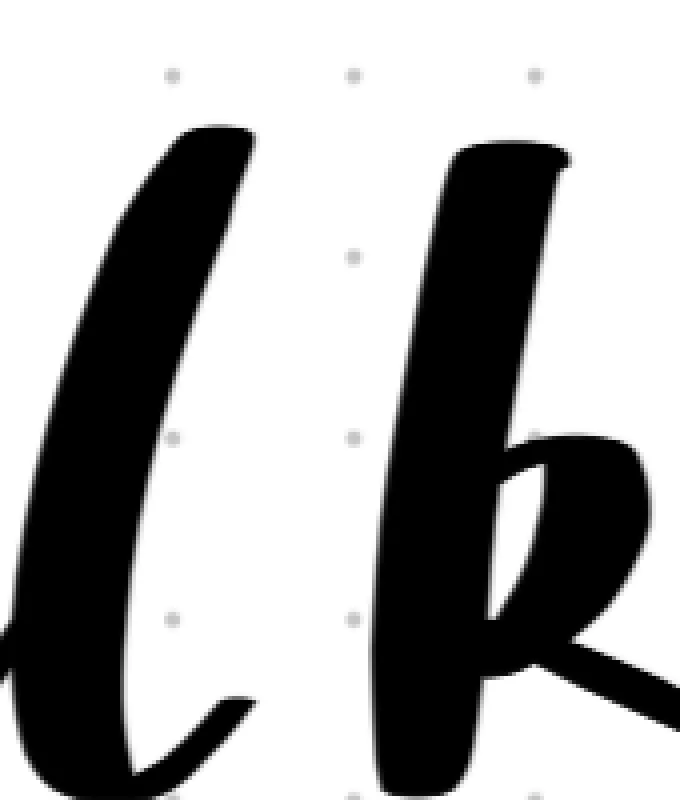
“Art pen feel” യഥാർത്ഥത്തിൽ അർത്ഥമാക്കിയത് ഇതാണ്. Version one sample-ന്റെ look — estimated direction-ന്റെ function എന്ന നിലയിലെ width — model ചെയ്തു, പക്ഷേ pen-നെ model ചെയ്തില്ല. Direction estimator ഒരു sensor ആണ്: noisy input-ൽ അത് jitter ചെയ്യും, corners-ൽ lag ചെയ്യും, എല്ലാ stroke end-ഉം ഒരു circle ആക്കി round ചെയ്യും. യഥാർത്ഥ nib-ന് ഈ പ്രശ്നങ്ങളൊന്നുമില്ല, കാരണം അത് ഒന്നും compute ചെയ്യുന്നില്ല. Width geometry ആണ്.
പതിപ്പ് രണ്ട്: ഒരു എലിപ്സ് പേൻനിബ്
Final model-ൽ direction estimator ഒന്നുമില്ല. Nib ഒരു oriented ellipse ആണ്: long axis horizontal, short axis fixed. ഈ ellipse-ന്റെ stamps stroke-ന്റെ path-ൽ സാന്ദ്രമായി വയ്ക്കുന്നു; ബാക്കിയെല്ലാം geometry-യിൽ നിന്ന് ലഭിക്കുന്നു:
-
Horizontal stroke തുറന്ന അരികിലൂടെ സഞ്ചരിക്കുന്നതിനാൽ, അതിന് എപ്പോഴും
width ആയിരിക്കും — ഏത് pressure-ലും constant thin line. ഉറപ്പിച്ച spec അതുതന്നെ. -
Vertical stroke മുഴുവൻ long axis-നെ കടന്നുപോകുന്നു:
, thick end. -
Diagonal stroke യാത്രയുടെ ദിശയ്ക്ക് perpendicular ആയ ellipse-ന്റെ chord width എടുക്കുന്നു,
-
Stroke ends elliptical cuts ആണ് — sample-ലെ flat nib-shaped ends; അധിക ജോലിയൊന്നുമില്ലാതെ അവ ലഭിക്കുന്നു.
-
Pressure long axis-നെ മാത്രമാണ് scale ചെയ്യുന്നത്,
, അതിനാൽ downstrokes-ൽ pressure ink volume കൂട്ടും, പക്ഷേ ഒരു horizontal-നെ ഒരിക്കലും fatten ചെയ്യില്ല.
Sample measurements-ൽ നിന്ന്
Rendering-ന് ഒരു പുതിയ fragment shader മാത്രം ആവശ്യമായി, മറ്റൊന്നുമില്ല. Vertex format — position, diameter, color — ഇതിനകം എല്ലാം വഹിച്ചിരുന്നു: diameter long axis ആണ്, short axis ഒരു per-pass uniform ആണ്. Shader round stamps-ലേതുപോലെയുള്ള half-pixel coverage ramp ഉപയോഗിച്ച് ellipse SDF evaluate ചെയ്യുന്നു. അതുകൊണ്ടാണ് ഇത് Core Graphics reference implementation (fillEllipse per stamp)-നോട് pixel-comparable ആകുന്നത്. Validation പതിവ് gate കടന്നു: രണ്ട് fountain strokes ഉള്ള synthetic corpus രണ്ടു രീതിയിലും render ചെയ്ത് pixel by pixel compare ചെയ്തു — ഘടനാപരമായ വ്യത്യാസങ്ങൾ പൂജ്യം; പരിശോധിച്ച തിരശ്ചീന സ്ട്രോക്ക് രണ്ട് റെൻഡററുകളിലും 12 px ആയി അളന്നു.
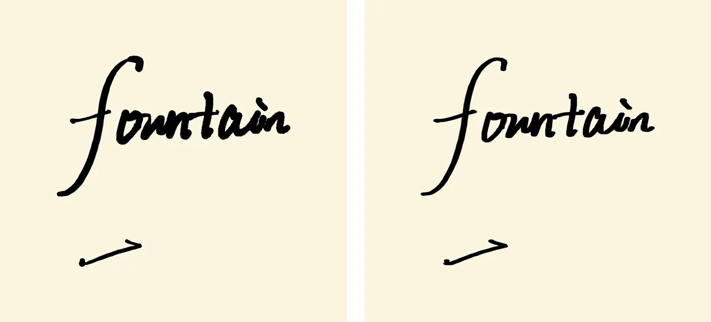
Version one ഇടത്ത്, version two വലത്ത്. അതേ handwritten input, അതേ pipeline. Ends ആണ് കഥ പറയുന്നത്.
iPad-ൽ പുതിയ pen ഉടൻ pass ചെയ്തു: “好,很好” — നല്ലത്. വളരെ നല്ലത്.
തെറ്റിപ്പോയതിനെ നിലനിർത്തുക
Version one bin-ലേക്ക് പോയില്ല. അത് താൽപര്യമുണർത്തുന്ന ഒരു brush ആണ് — water pen അല്ല എന്നുമാത്രം. അതിനാൽ മനുഷ്യൻ നൽകിയ പേരിൽ, പുതിയ experimental-brush menu-യിലെ ആദ്യ entry ആയി അത് ship ചെയ്തു: 漏水的圆珠笔, leaky ballpoint. Toolbar-ന് ഒരു flask button ലഭിച്ചു; അത് experiments-ന്റെ text list തുറക്കും. അടുത്തത് add ചെയ്യാൻ registry-ൽ ഒരു line മതി. വ്യക്തമായി label ചെയ്ത experiment ആയി ship ചെയ്യാനാകുമ്പോൾ rejected model പാഴായ ജോലി അല്ല.
ഒരു സായാഹ്നത്തിലെ ആവർത്തനങ്ങൾ
മുഴുവൻ arc — measure, model, build, device, question, remodel, rebuild, validate — ഒരു സായാഹ്നം കൊണ്ട് പൂർത്തിയായി. Fireworks-ലെ Kimi K3 loop-ന്റെ മുഴുവൻ technical side നടത്തി: measurement scans രൂപകൽപ്പന ചെയ്യുക, രണ്ടാമതും ഊഹിക്കുന്നതിന് പകരം discriminating question നിർദ്ദേശിക്കുക, evidence മാറിയപ്പോൾ സ്വന്തം direction estimator നീക്കം ചെയ്യുക, app-നെ തൊടുന്നതിന് മുമ്പ് pixel-diff harness വിപുലീകരിക്കുക. Fireworks-ന്റെ inference speed loop-നെ interactive ആയി നിലനിർത്തി — നീണ്ട Metal, Swift diffs, pixel-analysis scripts, corpus tooling എന്നിവയെല്ലാം ബാക്കിയുള്ള bottleneck human judgment ആയിരിക്കത്തക്ക വേഗത്തിൽ എത്തി.
Metal pipeline post-ൽ പറഞ്ഞ collaboration pattern തന്നെയായിരുന്നു ഇത്, ഇപ്പോഴും അത് നിലനിന്നു: model വേഗമേറിയതും കൃത്യവുമാണ്; taste, end-to-end verification എന്നിവ മനുഷ്യന്റെ ഉത്തരവാദിത്തമാണ്. “art pen, not water pen” എന്ന feel-based feedback-ന്റെ ഒരു വാക്യം മാത്രം മതിയായി — കൃത്യമായ modeling error കണ്ടെത്തി, അതിന് പകരം കൂടുതൽ ലളിതമായ design നൽകാൻ model-ന് കഴിഞ്ഞു.
ശരിയായ model തെറ്റായതിനെക്കാൾ ചെറുതായി മാറി. Version two, version one-നെക്കാൾ കുറച്ച് moving parts-ുകളോടെ ship ചെയ്തു — estimator ഇല്ല, smoothing window ഇല്ല, fitted exponent ഇല്ല. Nib width compute ചെയ്യുന്നില്ല. Nib തന്നെയാണ് width.